This text accompanies the release of Fragen at The Designers Foundry.
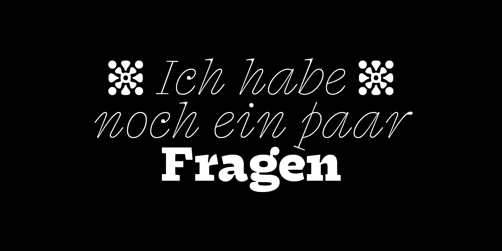
Fragen — which is German for ‘questions’ — is a low-contrast type family with spirited italics, born in the margins of a language course’s poorly duplicated worksheets. It develops a certain idea of eclecticism that I had previously explored, although in different directions, in works such as Nostra or Syne. A quest to balance diverse and sometimes contradictory elements into one cohesive and functioning typeface; one that would not always be logical, but somehow still make sense.
Fragen started with the wish of creating a typeface within this peculiar space between text and display. I wanted it to be legible and have a sort of technical overtone, while carrying a fair amount of bizarre elements. Looking for input, I was quickly charmed by the sturdiness of 19th century Antiques, as well as the satisfactory stability of a paragraph set with a typewriter. One of the first parts of the design process was to try and merge these two influences, using them as a starting point for the upright’s extreme masters.
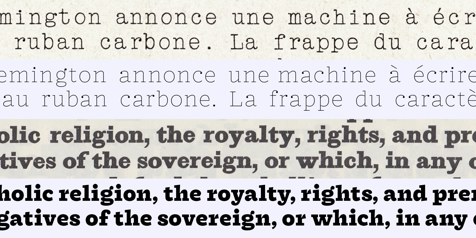
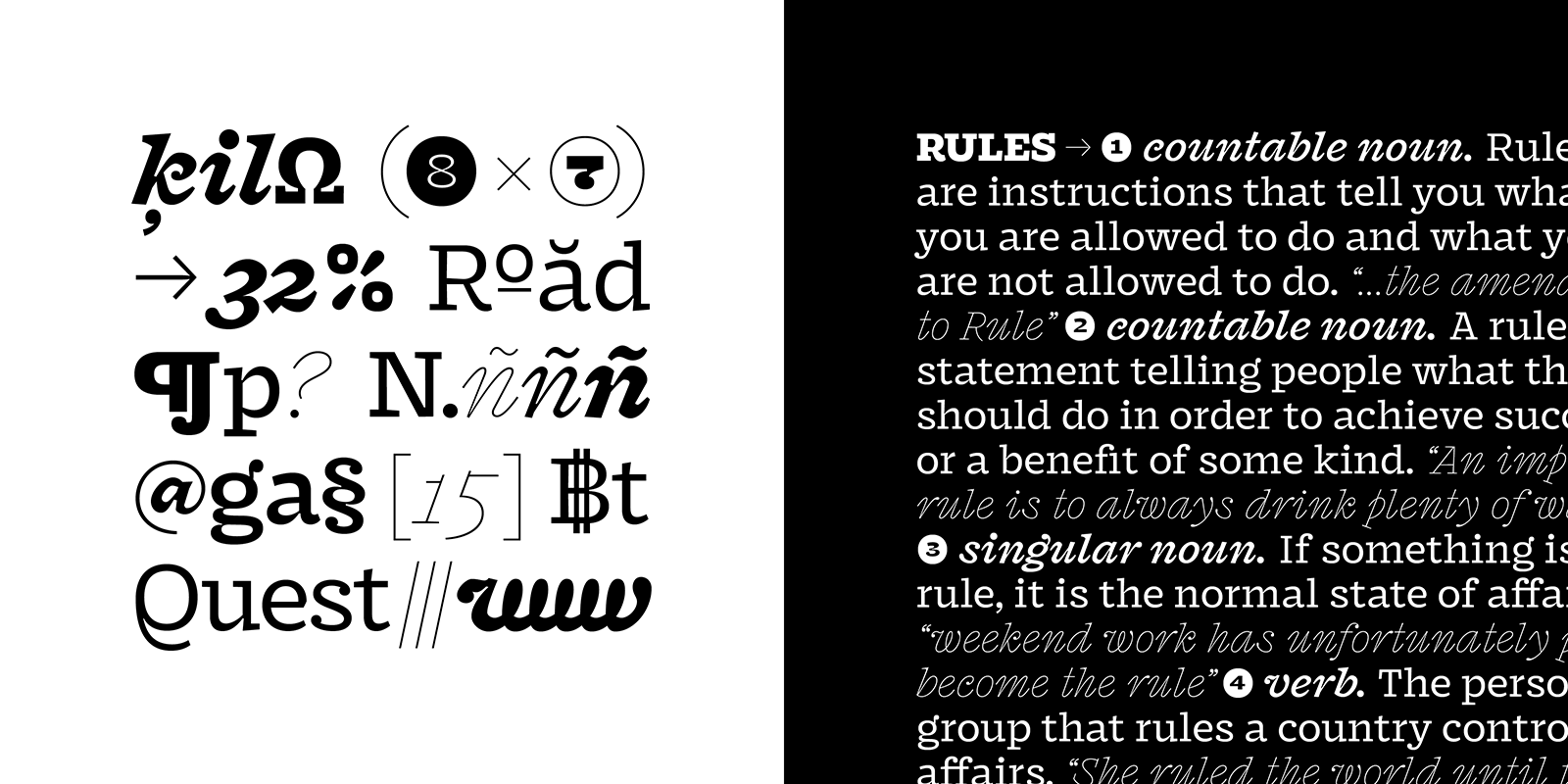
Fragen’s lighter master is loosely based on Schreibmaschinen-Schriften — or typewriter faces. Monolinear strokes and rectangular serifs give it a certain severity, balanced by the playfulness of the ball terminals. On the other end of the weight axis, Fragen gets chunky and slightly offbeat, taking many aspects of Egyptian typefaces. Unlike its thin companion, the Black cut features flat bottoms and ink traps, but also squarish curves and pinched connections, giving it a rather different tone. The basis for the Regular weight is a middle ground between these two marked universes: a way to use interpolation as a surprise and an incentive.
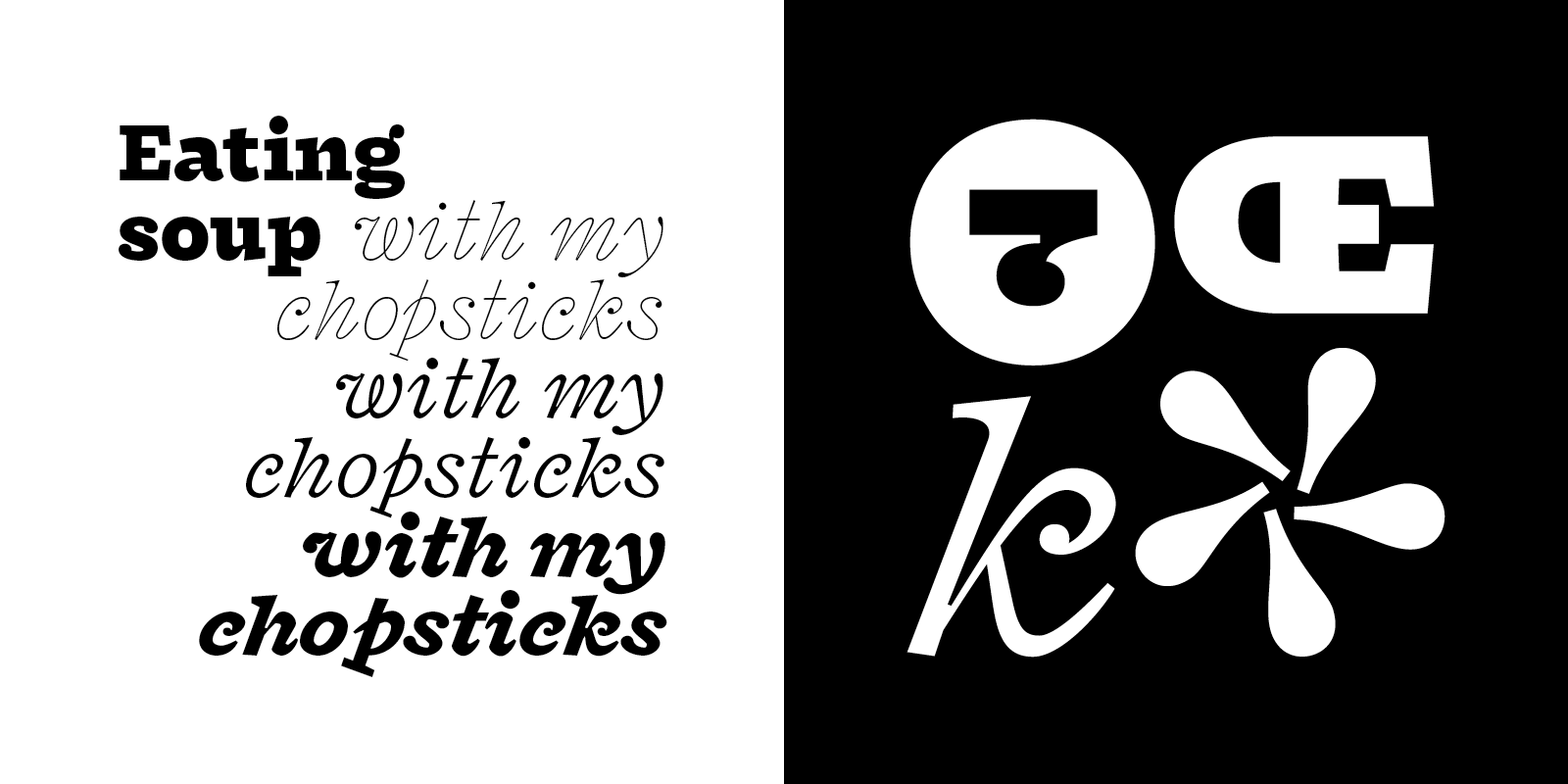
Fragen directly quotes some unorthodox elements found in 19th century specimens, like the lovely side-tailed Q or some quite radical endings, sometimes almost sans-serif-like. I like the idea of fluidity between the severe boxes of type classification. In this case, it somehow reminded me of a denomination I saw in a lettering manual: the Blockschrift mit Füßen, literally “block letters with feet”, implying that, maybe out of laziness, some letters had been created by merely gluing serifs onto another model.
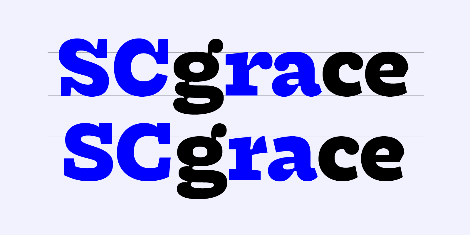
Aiming for stability, Fragen features slightly rectangular rounds and open counters, as well as a generous width to sit comfortably on the baseline. Although it was the initial source of inspiration, the moment came when the classic Antique letter structures seemed to just weigh down on the overall design. It needed to go in a more radical and more personal direction. Uppercases like C, R or S were replaced with more Garalde-like versions, while some lowercases with soft ball terminals, such as a and r, were relegated as alternates, making way for sharper shapes, borrowed from humanistic sans-serif designs.
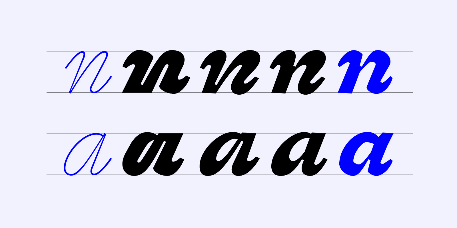
Fragen’s most distinctive feature surely is its dynamic italics. Constructed on a steep 20° slope, they are meant to contrast with the stability of the upright cuts, making any text look like a flowing river. And if the first inspiration for Fragen was towards 19th century Antiques and Clarendon-like manifestations, its italics look in the direction of more decorative letter-shapes.
I tried to take the design of Fragen italics as a separate exercise. It means that, whenever I designed a new glyph I first and foremost made sure it belonged within its own cut — for example Fragen Thin Italic — more than restraining myself trying to find a common denominator for the entire family. Thus, many adjustments or inconsistencies can be found between uprights and italics, sometimes even between some of the weights.
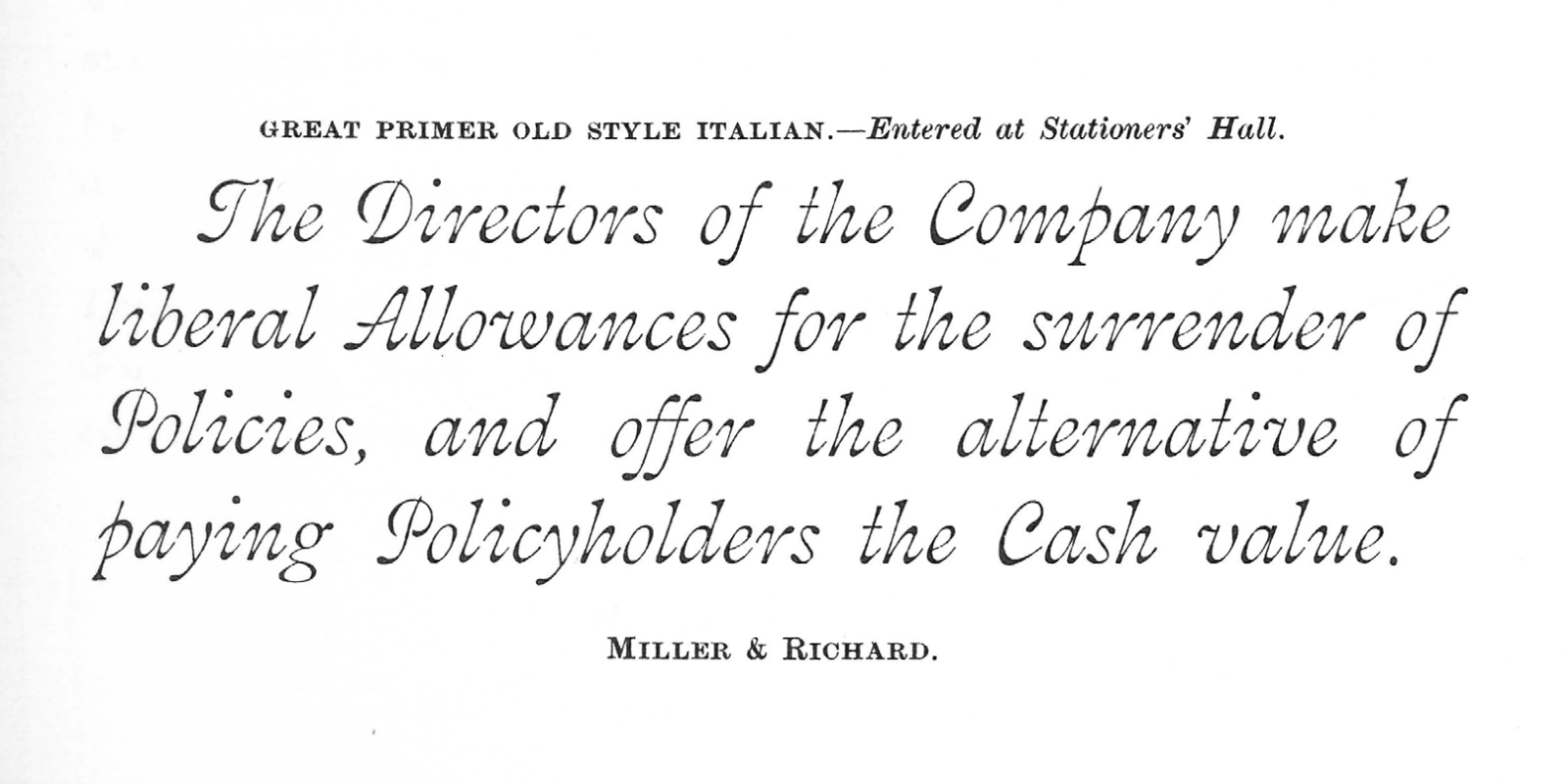
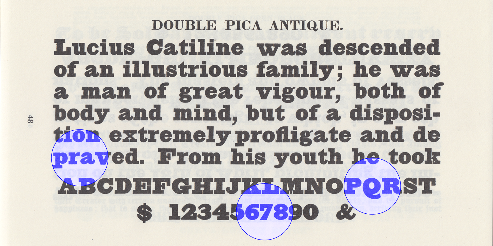
A major inspiration was Miller and Richard’s Great Primer Old Style Italian as seen in their 1873 specimen. Designed for medium sizes — Great Primer is about 18 points — this wavy cursive is a reverse-stressed display version of the foundry’s rather successful Old Style Antique. The same Old Style Antique that was used as a starting point for Ellmer Stefan’s excellent Triptych.
Looking at a reverse-stressed typeface while designing the italics made me consider contrast differently. And eventually convinced me to make it much higher than the upright’s. This way, it gets a sort of delicate and flourished look when set in big and a real vibrance when used as highlights within a text.
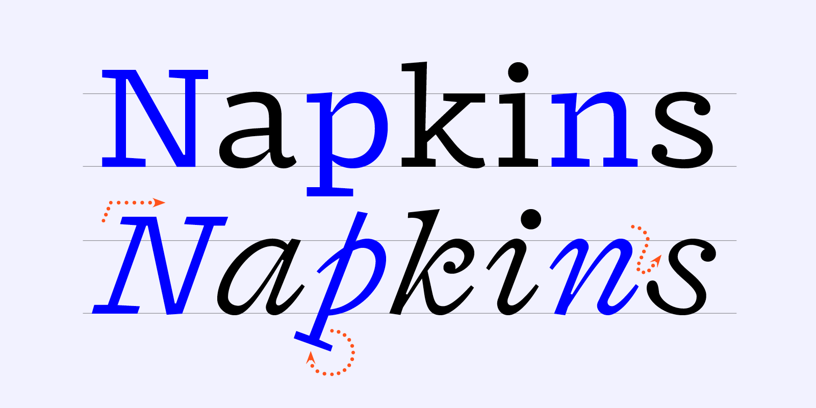
Fragen’s italics first strike with their dynamism, but a closer look reveals a lot of restraint and an almost mechanical feeling. This is the consequence of incorporating and mixing several ways of italicisation — curviness, slant and rotation. While most basic lowercases are based on a continuous and sinuous gesture, the capitals, loosely inspired by François Ganeau’s superb Vendôme, feature a simple sloped structure, whose stability — and nearly rigidity — is accentuated by long horizontal serifs. Finally, details such as the rotated serifs on lowercase p and q, as well as the default double-story g, participate to a machine-like look, node to some early typewriter inspirations. This contrasts with the overall calligraphic spirit, for an uncanny and lively result.
As mentioned before, the first step was to coin Fragen Italic’s lighter weight and general ductus. From there, it was an interesting challenge to imagine a bolder master that would not just be a logical expansion, but bring something new to the table. Temporarily leaving out the idea of long-ish texts and small-ish sizes that were key for the upright cuts, I chose to explore the potential expressivity. This carried me into strange display-like directions, not suitable as end results but very satisfying and liberating to draw.
After trying extremes in stability and fluidity, in consistency and unpredictability, and slowly settling for what I judged to be an interesting mood, it was time to tune it down and make it fit to the intended purpose. In the end, and because of the necessity to survive in rather small size, Fragen Italic’s bold weights also borrow from Dwiggins’ “M Formula”. They’re less fluid than the light weights and carry a much more engraved feeling, with important ink-traps, exaggerated features and broken curves.
As I was designing Fragen while starting to learn a new language, I found myself thinking of the two processes as sharing similarities. Both are seemingly extremely ruled and codified, but in the end organic, fluid and sentient. I often have the feeling that my designs preexist me, somewhere, and that my job is to uncover them, understand them and give them a proper form. A language, like a design, is never acquired from nothing, never detached from all references. And the process of bringing both of them to a usable stage doesn’t happen by a simple mechanical stacking of informations and logic, but requires a good part of instinct and relies a lot on trial and error.
Everything starts with an input, an observation of our environnement which lead us to formulate hypotheses. We imagine and sketch the next step of the system, based on previous accepted elements. It then gets validated or not by the direct surrounding. And the more we already know, previous languages or previous designs, the more we can try and transfer logics. Fragen’s design process really felt like this “shape acquisition”, a slow and organic journey of testing out hypotheses, seeing a system grow according to its own repercussions and exceptions.
Making Fragen was without a doubt a challenge; a larger family than I had designed before, that sometimes seemed a bit vertiginous by refusing some prefabricated logics in favour of a lively diversity. The result is a display-text hybrid, with a strong slab flavour and lots of unpredictable traits. And I am now very curious about how it is going to be used, as different sizes could reveal extremely different voices.
—
Fragen was designed by Lucas Descroix and released by The Designers Foundry in October 2019. Many thanks to David Johnathan Ross and Miklós Ferencz for their generous time and help, to Donny Trương for his consulting on Vietnamese diacritics, and to Benjamin Dumond for his early enthusiasm. Plus constant support and feedback from Elenor Kopka.
—
Get Fragen, see it in use or have a look at its PDF specimen.