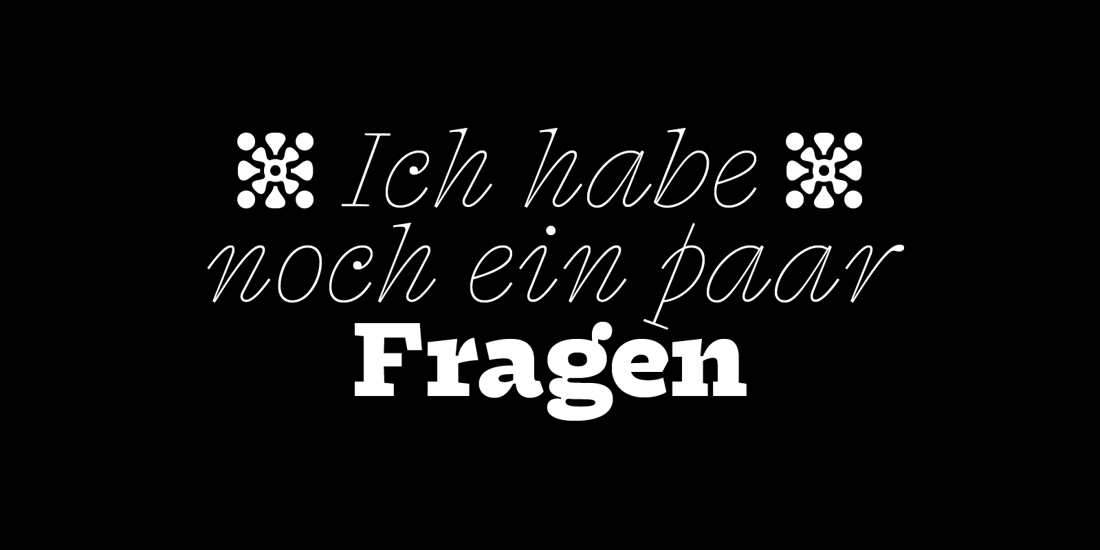
Notes on Fragen, a text-display hybrid with a strong slab flavour and spirited italics, born in the margins of a language course’s poorly duplicated worksheets.
A kilo of lead and a kilo of feathers
2019-04-17
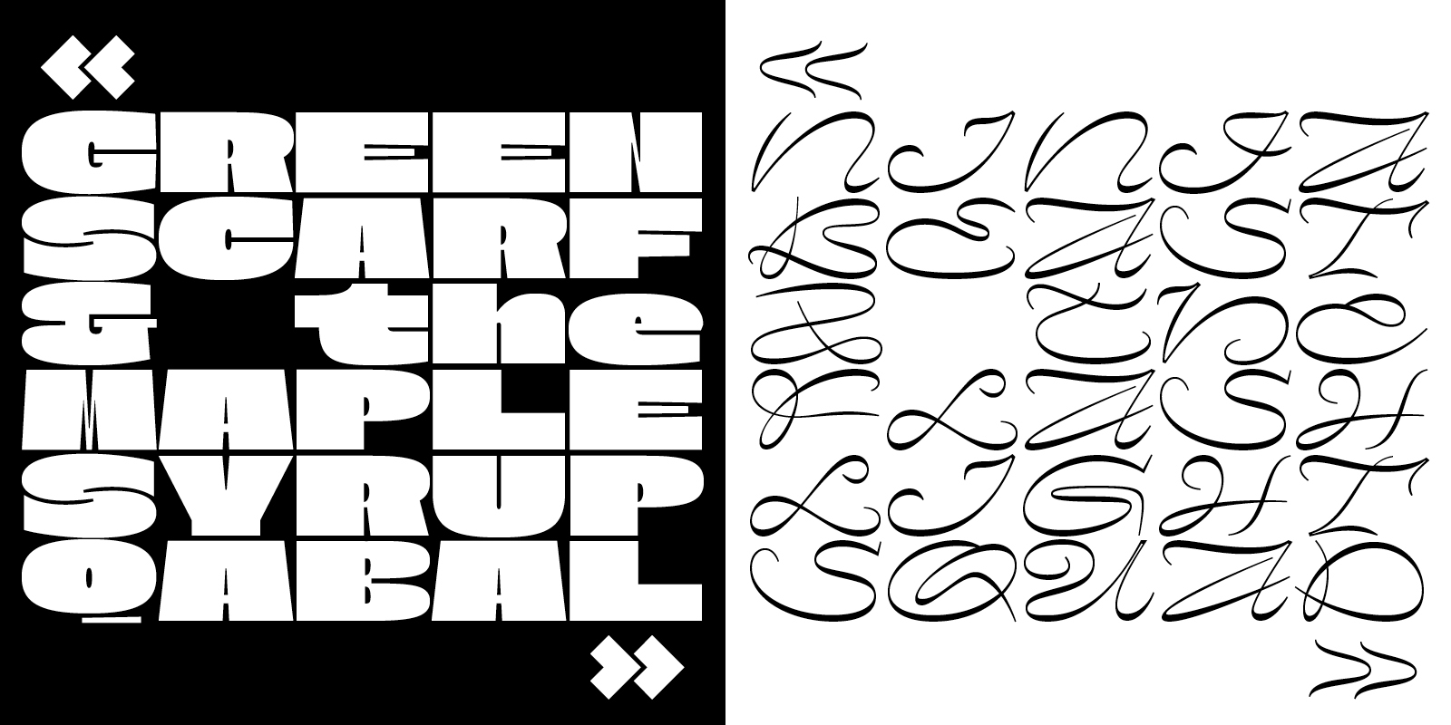
Notes on Nostra, an extra-wide monospaced type family, released and updated monthly on Future Fonts. Playing with a feeling of satisfaction, how a few thin strokes can create the shape of a letter, either cut in a solid mass or traced in the air, Nostra’s two distinctive cuts are only brought together by their extreme proportions.
[ read more ]
2018-06-14
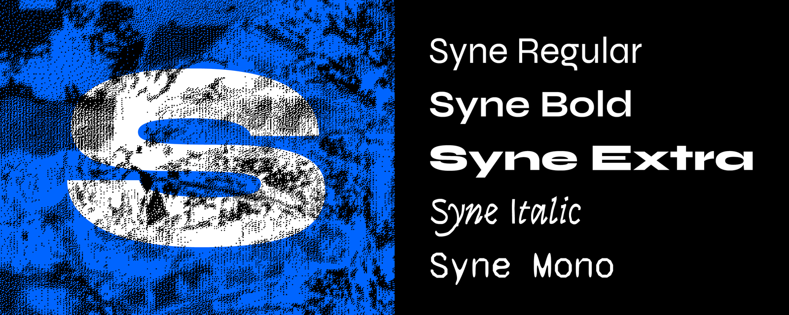
Notes on the design of Syne, an unconventional type family designed with Bonjour Monde for the art center Synesthésie, and released under open-source license.
[ read more ]
2018-02-24
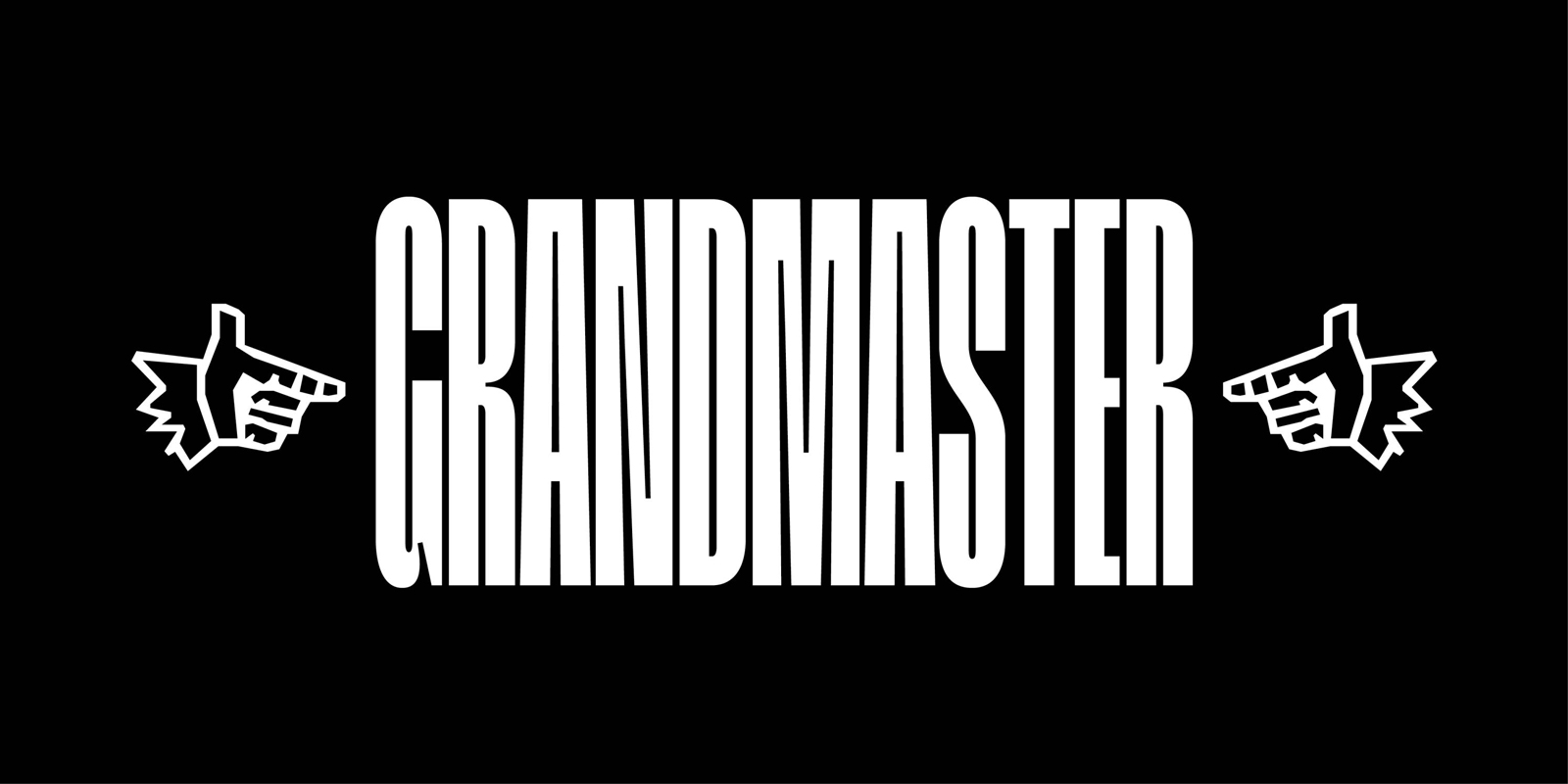
Notes on the design of Grandmaster, an extra-condensed hip-hop inspired titling typeface, exploring rhythm and legibility.
[ read more ]